[EDIT – June 26, 2016: Updated and detailed histograms are now available and should be utilized. See: “Update to the Shared cM Project.“]
Many people have benefited from the more than 6,000 submissions to the Shared cM Project, an incredible crowdsharing project (which is still collecting data HERE!).
One issue with the Shared cM Project, however, is that it is user-submitted data, meaning there are invariably two inherent problems that will affect that data: (1) data entry errors; and (2) relationships that are not accurate.
It is actually a very simple matter to resolve both of these issues, and that is to provide the distributions for the data. The distributions will show clearly where the outliers (the errors and the incorrect relationships) reside. To generate distributions, I enlisted the help of mathematician Ingrid Baade, who volunteered all of her time. I am forever in her debt for this contribution!
Here is a wonderful diagram that Baade generated with data from the Shared cM Project, showing distributions:
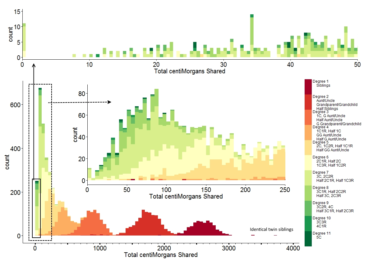
This image/file is shared pursuant to a CC 4.0 Attribution License (23 December 2015).
Reviewing the image, the outliers (errors) become clear. For example, looking at the ranges from “Visualizing Data From the Shared cM Project,” we see that someone reported 121 cM for an Aunt/Uncle/Niece/Nephew relationship. This relationship is reported as “Degree 2” in this chart. We see the 121 cM in the middle expansion box, which is an extreme outlier from the central distribution of “Degree 2” around 1700 cM.
As another example, for half-siblings, the reported range was 787 to 2143 cM, with an average at 1731 cM. Half siblings are also “Degree 2,” and we see that for the small handful of “Degree 2” relationships reported in the range of 787 to 1200 cM, these are extreme outliers. Accordingly, these individuals should be considering another explanation for their observed genetic relationship. Indeed, thanks to the chart we see that these appear to fall squarely within the distribution for “Degree 3” rather than “Degree 2.”
Will you be republishing the centimorgan ranges and medians for each relationship degree with the outliers (errors) removed?
I would hope you would be able to re-verify with the submitter of the outliers before throwing them out
Here’s an odd one: a new match–and one of my closest–appeared at GEDmatch last week, with one big matching segment of 92.9 cM. My mom and brother both match at the same location with essentially the same length of that single matching segment. The estimated number of generations to a common ancestor is 3.6.
We both have complete trees going back five generations. No match. Looking back further, we find that we are actually 5th cousins, 1x removed–with a common ancestor at 7 generations back.
I wondered if we happened to have any evidence of “double cousin,” but there is no sign of that. I know your work tends to focus on 3rd cousins or closer–but have you seen many cases of nearly 100 cM shared between such distant cousins?
Having read your numbers I went back to check and found a comparable situation.
I have a known 5th cousin 2R on my paternal line who shares a 75cM segment with me and 88.3 with my sister. The match’s daughter, 5C3R, shares 57cM with me and 57.3 cM with my sister.) GedMatch predicts about 3.7-4.0 generations between us, as with your case. Our nearest known MRCA is much further – 6 generations on my side and 8 generations on my match’s side. This match and her daughter show up closer than several confirmed 3rd cousins and a confirmed 4C1R on my maternal side.
At the same time I have two 3rd cousins on that same paternal line who are themselves 2nd cousins. I match one of them with an 88.5cM segment and the other with a 7.0 cM segment. Neither of these 3rd cousins match the more distant cousins at 7cM or more (6.5 is the largest segment.)
I hasten to note that these are all colonial New England and Nova Scotian lines so perhaps there are endogamous effects for the earlier generations but, like you, I find the numbers a bit unusual. [note: the 3rd cousins are in Blaine’s data but the more distant are not.]
I too have similar matches, no known common ancestor in 7 generations (so we have work to do between us to get further back). My family is purely England and my matches (50cM) are 7 generations USA. My present theory (yet to be proven) is the family is about a third from one Derbyshire village which is documented in ~1800 as everyone is everyone’s cousin. This cannot be unique in England in those times, nor in remote villages in USA. So the genetics would appear to be older, since they are not more mixed? Does this make sense?
Thank you so much for posting this, it is really ground-breaking and a chart that I will refer too often. A client has a potential NPE (her grandfather may not be her grandfather). The closest other family member to test is a first cousin, who could be a half first cousin. Thanks to this chart, I now know that trading het could provide evidence for or against the NPE, since the distributions overlap but each have their distinct expected shared DNA ranges. Wonderful!
(Refer to, testing instead of trading. Phone is acting up)
Thank you for these wonderful charts. I appreciate being able to see the quantities for the smaller than expected returns on the 6th and 7th degree relationships.
Thank you Dr. Bettinger for beginning and managing this project, and thank you to Ingrid Baade for the beautifully compact chart of data, and thank you to the those who have submitted their data so far.
Using this significant number of atDNA matches, it is nice have a visual representation of the how amounts are spread out over the ranges, somewhat bell-curved, as rather expected, but now with some confirmation.
It is interesting to wonder how much of the reduction in matches beginning around “degree 8” are due to the matching algorithms not seeing a match, and how much is due to the increased difficulty of building the bigger trees required to determine how those more distant matches actually match, that keep them from being submitted to this project.
Thank you so much for gathering and reporting these results! I found this distribution graph helped me greatly in digesting your data.
I agree with you that there are some obvious outliers. Some of the half-sibling outliers could be explained by “adoption” of more distant relations without disclosure.
Cases of “false paternity,” that could be in the 0.5-3% probability per generation, would also certainly produce outliers on the low side. For example, if the probability of “false paternity” were “fp” per degree and we use “D” for the Degree of relation, then the chances of a “false paternity” event would be 1-(1-p)^D for the relation or almost 3% for a 3rd degree relation and a 1% “false paternity” rate. Obviously, more extreme outliers could happen when a recorded male path were in fact “false paternity” with a male cousin.
I understand why you displayed the results as cumulative for each bin, but it would be nice to find a way to display each class as zero based. Perceptually, I found myself giving more weight to higher Degree relations because they were raised by the lower Degree relations. See the graph at http://segmentology.org/2015/11/07/segment-size-vs-cousinship-chart-needed/ for the concept of displaying each Degree zero based.
I am dealing with poor paper records for some newly discovered cousins, where we are trying to distinguish a relation that could be Degree 5 (Half 1C1R) or Degree 6 (2C1R). This plot of your data shows what I thought to be true: this will be difficult with DNA alone. Testing more cousins will help, but only some; confidence will only improve as 1/sqrt(#tests).
Sorry, correcting a typo in an equation. The correct version is:
… then the chances of a “false paternity” event would be 1-(1-fp)^D …
My compliments, this is by far the best diagram i found on this subject. Were data from ftdna, 23andme, ancestry and gedmatch combined? The values tend to depend on the selecting of the parameters.
I have a DNA match of 591 cm with my Father’s Brother (My Uncle) They have the same Mother but could have different Father’s could that be why it is so Low?
My Ancestry DNA results show I share 923 cM with one and 910 cM with one. These two are brothers. I have been told that either their Father or their Uncle was my biological Father, but I’ve never known. With this amount of shared DNA, is it more likely their my half brothers or first cousins? Thank you.