EDITOR: Last summer while co-teaching a DNA course at IGHR, one of the students in the class had some questions about a mystery she was trying to solve in her own family. While discussing the brick wall, Lauren McGuire showed me a chart she had created with all the test-takers and their relationships to each other. Unlike most other methods of displaying names, relationships, and shared DNA, this chart was incredibly efficient and easy to understand. All the information was right there! It was dubbed “The McGuire Method” by the class, and it remains my favorite way to display shared cM data among a group of individuals.
For example, this method would have been perfect for displaying all the information in “A DNA Case Study: Revealing a Misattributed Parentage Event with DNA,” but I wanted Lauren to announce her method first. It would be an interesting exercise to go back, now, and re-plot that graph using the McGuire Method.
A huge THANK YOU to Lauren for this blog post and for sharing her method!
The McGuire Method – Simplified Visual DNA Comparisons
(by Lauren McGuire)
A problem all genetic genealogists and amateurs alike face is how to analyze or present DNA comparisons and family relationships in the most direct and succinct manner possible. This can be quite challenging as anyone who’s attempted this can attest.
My general methodology used to consist of a hand drawn family tree chart, a printed GEDmatch autosomal matrix and a lot of scribbles and notes. That works fine for straightforward charts, but as the number of testers increase, the DNA dynamics can get quite cumbersome and confusing. At one point when trying to solve the mystery of my great-grandfather’s birth, I had twelve DNA testers and a whole lot of data to analyze. I reached a critical point where I had a working hypothesis and needed to enlist the help of a seasoned genetic genealogist. I also knew that my best shot to get help was to present the voluminous DNA data in the most efficient and streamlined manner possible. In other words, my general methodology would not do. Hence, the McGuire Method came to fruition.
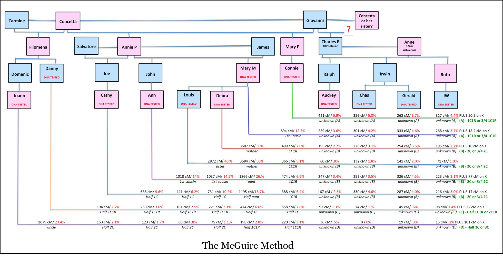
The McGuire Method can be summed up as one stop visual shopping where a family tree chart shows who has tested, their relationships to one another and all DNA data clearly assigned, diagrammed, and presented on one page.
At this point, I have to add that the lucky “seasoned genetic genealogist” I contacted was Blaine Bettinger. The next thing I knew, Blaine used a modified version of the chart as a teaching aid in the Tools and Techniques Genetic Genealogy class at IGHR 2016. Fellow class member Skip Duett enthusiastically coined it, “The McGuire Method.”
The McGuire Method Diagram Structure and Process:
The following diagram shows the twelve aforementioned DNA testers, with all relevant DNA and relationship data shown. When reviewing the chart, note that the four testers on the right side, Audrey, Charles, Gerald and JW, are all descendants of my elusive Great-grandfather Charles R., and are either brothers or first cousins to each other. DNA confirms all relationships perfectly. Since the purpose of my analysis is to compare their DNA data to the other eight testers who are known descendants of Concetta, I found it extraneous to include the DNA between my known four. Had I added the data, it would have cluttered the analysis. I also have left off non-essential spouses, which is a common exclusion for this type of analysis. What’s important to remember is that each situation will be slightly different as there are no rules as to how you build your chart or whom you include.
Click to Enlarge
The first step is to create a family tree chart. That’s simply the normal box structures showing generations of grandparents, parents, children, siblings and cousins. It can include second marriages and half relationships. Again, each chart is unique. Once the family tree has been charted, DNA data and relationship descriptions are added.
Each tester (starting with the left most position on the chart) needed for the DNA comparison is assigned a color coded line drawn first vertically directly down from the center of each tester’s box on the chart and then continued and extended horizontally across the page to the right.
The relationship and DNA comparisons between any two individuals is designated on the first person’s (the more left-sided person is considered the 1st person) horizontal line directly below where it crosses below another tester’s box at the midpoint of the second tester’s vertical plane. The top of the line shows the total cM shared and/or percentage shared. Directly below the line is the relationship if known, or the speculative, if unknown.
For instance, if we want to compare Louis to Connie, we plot their shared 366 cM on top of Louis’ blue line and their relationship, 1C1R, below the line. These are written directly below Connie’s box in her vertical plane.
Conclusions
The most beneficial aspect of such a strong visual summary, is that you can use your knowledge and also compare to projects such as Blaine Bettinger’s Shared cM Project or refer to one of the average cM share charts on the ISOGG Wiki or DNA Detectives to determine which cM relationships do or don’t fit properly. Conversely, if you have a match that you know fits somewhere, but haven’t been able to place, knowing the cM match and the likely location where they belong can bring a seeker much closer to the proper spot in a family.
The McGuire Method can be used to represent any sort of relationship patterns or data one wishes to present. My IGHR classmate, Skip Duett, created one chart to trace autosomal DNA on multiple lines and in a separate chart, to trace the Y-DNA along the male line [Editor – these charts can be found by joining the new DNA Facebook Group: Genetic Genealogy Tips & Techniques!]. For the Y-DNA, he showed markers tested along with numbers of mismatches.
With all the puzzles to be solved and dynamics to be tracked, your imagination is the only limit when using the McGuire Method in this data—rich genetic genealogy landscape.
Excellent information, and no doubt a useful tool.
Question – what happens when cousins marry cousins – how does one get around the diagramatic problems of such relationships ?!?!?
Constructive comment – since many of us are typically researching 3 to 6 generation to MRCA cousins
[a] the charts could get quite large, and
[b] it would be helpful to include another line of text on the horozintal lines to indicate chromosome number [1 to 22, and 23] and the location [short version], ie 22M to 45M on the chromosome.
Well done Ms McGuire !!!
Thank you Alan! I appreciate the exclamation points!!!
The best I can suggest for showing relationships for when cousins marry cousins is to try to figure out a way draw additional interconnecting different color lines on the family tree section of the chart that peek behind the boxes. You might also add a notation or code within the person box to designate double relationship. For instance if Second cousins,Mary and John, married, perhaps note (m2c) beneath each of their names in their respective boxes. If several on the tree married a known cousin, then add a symbol to cross reference which two within the chart married. For instance, one pair of 2C1R who married, might have a (m2c1r%) in the box where as another pair with the same relationship would have a (2c1r@.) The symbol at the end or even just changing the text color would do the trick.
I like a challenge – send me the basic informations and I’ll see if I can craft something efficient.
One other suggestion would be to make place everyone with a significant double relationship in the proper spot on their chart in all places they belong. Make their boxes and lines a slightly different color and place a notation at each intersecting line. Use notations and symbols on the vertical lines that tie it all together what the sharing amount you wish to show.
You could easily include one or multiple stacked horizontal lines to show as much data as can fit on the page, I have a 20 + person chart I’m creating and that doesn’t include the non DNA testers. It’s a bit deep but getting very long. Excel is perfect for that because there are not restraints. However the structure and function is perfect for my analysis.
Very nice visual 🙂 I’m tracking quite a few tests of close family that might be better displayed this one than the way I’m doing it now, which requires both a graphic and a separate Excel spreadsheet to show all the relationships.
Thanks to Lauren McGuire and Blaine for sharing it 🙂
That’s one of the great things about this method, it shows both relationships and shared cM all in one convenient place!
Thank You Barbara. I too, used the graphics and excel together, but it is much more time consuming and I didn’t feel it allowed for organized and easily compared relationship data. At least not as efficiently presented as it could be.
I always try to draw on paper first because I like to arrange lower generational testers to the left most side of the tree so their horizontal lines will (or should be) less than those directly above them. That’s a personal thing, but I find it easier to see the number patterns.
Barbara – I was writing all of these responses Pacific time – so 2:30 AM and I don’t think I made full sense.
When I said I like to arrange lower generational testers to the left most side of the tree, it’s so their horizontal lines will fall below those on a higher generational plane. This way, the cM shares to a common relative/cousin should show visually high to low on the horizontal lines. As an example, look at the section of the chart comparing Audrey to Mary, Louis and Debra. Mary is Louis and Debra’s mother, sharing 259 cM with Audrey. Her children share with Audrey at 195 cM and 60 cM. I like seeing Mary’s on the top line, with her kids falling underneath, the same way a family tree is drawn – older generations on top.
Thats a wonderful visual, thanks for sharing.
I’m glad you enjoyed it, thank you for reading!
Thank You!
Thanks Jo!
A great chart! What application is being used to create it?
This chart was created in Excel. Others have used draw.io or LucidChart.
Intaglo for mac and Y-ed for Mac or PC. Excel can be time consuming, but I’m making strides. For the others, I am a user friendly type of person so if it isn’t inherently obvious or has a good old fashioned users guide, I get impatient. Clicking around and asking questions only to get irrelevant answers tends to annoy me. So I stick to what I know.
This is very cool! I plan on writing a proof of a circumstantial case for an ancestor later this year. The case was solved in large part with Y-DNA testing matching, location of parties at time of a marriage, and autosomal evidence to support the mother.
I didn’t have much of a plan to show the autosomal evidence, other than to list the matches. I think this will be a much better way for me to show the autosomal portion of the proof.
Excellent chart. I think this is a winner!
Good Luck Marilyn. This sound perfect for you! Thanks.
I am trying to use Excel to create a McGuire diagram and it is a slow process trying to keep the elements in line (horizontally and vertically). Any suggestions from people who have done this would be helpful. I know it will be better with more practice, and I am retired, but….
I have not yet tried to create a McGuire diagram, but I’m familiar with MS Visio. I believe you can get an online version, even on a trial basis and it would make this so much easier.
Tim,
I’ll provide Blaine with a one page Excel sheet – the McGuire Chart without my information on it. Feel free to experiment. I’ll leave multiple boxes and lines for you. I’ll also space the grid sizes to help. All you’ll need to do is be able to grab objects to move, copy and paste objects if you want more and change the color of the horizontal and vertical line bars (also a shape insertion.)
I had a tough time at first keeping the boxes level horizontally and vertically but figured out how to keep them in check. The only problem I really have is the small connector lines designating relationships. They get so crooked.
Lauren McGuire is a GENIUS! Sure wish I had thought of this!
Is there a question in there? My kids would probably replace that first explanation point with a ? But thank you, Michele – I’ll go with that 😉
The “genius” says “Note to self – never send replies in dark room at 2:45 am…. EXCLAMATION point.” SMH.
Can you please tell those of us who are technologically challenged how you created the chart on a computer? Excel? Google Docs? How to draw a box around a name and how to draw a colored vertical line that continues to same color horizontal? Thanks!!
Anna,
I will give Blaine a basic chart that he can post for everyone to use as a template. I’ll leave you with a set of male and female boxes and some of the connector lines. You actually add the box shape and color it. Then add the text inside. It’s quite easy with a tiny bit of practice.
The lines are similar. Just add the line as “insert shape.” Once the box or line shapes are inserted, you can manipulate the color and thickness of the lines. You just need to practice how to grab and move the objects.
My method for charting our DNA group shows the estimated change points in a simplified family tree. I refer to it as a Mutation Descent Chart. It can be seen at http://hurlbutdna.pbworks.com/w/page/19764793/Mutation%20Descent%20Chart . We try to keep the public information someshat anonymous. Appreciate the work you do and hope you find our effort interesting.
Gil,
I don’t do much with the Y DNA yet but I like your chart. It seems to have the information you want in a succinct format. One of the class members last year used a McGuire Chart to plot a full family of Y testers and various markers he wanted to trace. There are no limits to the data one can present.
What a powerful chart! But my Excel skills are awful. Has anyone created a template they’d care to share with the community?
Thanks!
Very nice chart idea. It combines the “spreadsheet” and the family-tree presentations into a single diagram. I immediately tried this out for a family mystery I am working on. It seemed to work out well. You have to choose carefully what to include and what to leave out unless you want a poster-size chart.
I drew mine in the free web-based drawing tool at draw.io . It’s a chart-oriented drawing tool similar to Visio or the old MacDraw. There’s a bit of a learning curve, but it wasn’t too difficult. draw.io has templates for various types of charts. Maybe they could be persuaded to include something specifically to make family trees easier.
Jamie,
I specifically left out all the interrelationships in the four testers on the right – Audrey, Charles, Irwin and Jerry, because I am certain of their relationship to each other and those matching numbers would have cluttered the analysis. The purpose was to compare my four Reed side descendants to all of the other Picariello/Marrone/Cary descendants.
I’ve since decided to add eight more people to the chart – mostly descendants on the Charles Reed side and to show all matching data between everyone. It’ll be big, but I’ll print on multiple sheets and paste it together. One of the most fascinating things I found when I expanded this group was that one cousin descended from Ralph is a 3C to five other testers and the 3C ranges are from 14 cM to 177 cM. I like looking at oddities like that. It reminds me never to take a given using the small “average” range.
I am very curious about the conclusions Lauren was able to draw from the chart. She was trying to identify the mother of her “elusive Great Grandfather Charles R.”, right? Was she trying to decide between two people–Concetta and her sister–or more than two people, i.e. Concetta, her sister, and someone else? Since Joann and Danny on the far left are not descended from Giovanni, yet mostly share DNA with Charles R.’s four grandchildren on the right, doesn’t that prove that Charles R.’s mother was Concetta or her sister? Can today’s DNA tests tell you which of the two it was?
Thank you.
Julie,
Initially I tested Cathy and Ann. Or I should say I target tested them based on a DNA match that was an approximate 2nd cousin 1R to Charles, my father. After over a year of gathering data, I had 8 testers in the group to the left and compared them to the Charles Reed descendants group on the right. Each of the first 4 or testers from the left as compared to all 4 Charles Reed descendants had me convinced Concetta and Giovanni were those elusive parents. However after testing Danny and his niece, I had to re-evaluate. Their match levels were just too low and I had to make it all fit and make sense for every single relationship. My conclusion was that the only way everything would fit is if Giovani and Concetta’s sister Anastasia were Charles Reed’s parents. There are many other factors (no family relationship between the Italian spouses) and no otherwise cross endogamy between the two sides.
This chart helped me analyze and obsess efficiently. I’m now trying to get two more testers to jump in – grandchildren of another Picariello/Marrone child. They said no once…. but I’m going to try again 🙂
Oh my…. I apologize to commenters who have asked questions. I missed all of this and will begin answering the questions in detail this weekend.
-Lauren McGuire
This method has helped me SO much! Is there any chance that any DNA testing companies (like ancestry, ftdna. 23andMe) would consider using a visual data display with our own family trees to help with mapping our matches? This could have a serious impact in industry if they utilized this method.
Hi, I would love to try using this technique. Has the template that Lauren mentions been made available? It would be great if I didn’t have to start from scratch.
Also, Lauren – if you haven’t already – you might want to try using the connector lines from the AutoShapes on the Drawing menu (the ones intended for flow charts). That might solve your problem with them going crooked.
Thank you for sharing this with the rest of us!
How do you join
For years at work I used PowerPoint, so am reasonably adept. I have created a couple of these charts using PowerPoint and have found the ability to align boxes and text is really easy using PowerPoint’s alignment tools and am happy with the results.
Hi Lauren, I’m very (3 days) new to DNA genealogy and the challenges it offers! Generally, my trees are built on reading newspapers, court records, BMD and so on. Hence my existing literary-based research skills became redundant when shared DNA results disclosed a 2nd cousin which *may* lead to the unknown grandfather, i.e. 25% of my ethnicity and heritage.
Using my analytic (maths) background, yesterday I constructed an incidence matrix of shared matches, colour coded cells for 2nd, 3rd & 4th cousin relationships, looking for clusters. Today’s challenge is hypothesis testing by fitting my ancestor into known family trees to test whether a ‘predicted’ DNA result aligns with the actual DNA lab. result.
Now that I’ve read Lauren’s “The McGuire Method” I will review my approach.
Have I understood correctly that in the Giovanni-Concetta chart the DNA 2872 cM between Lois and Debra is a measured result? As I see it, I am hampered because I know only my DNA-match cM to each of, say, 20 individuals rather than their DNA matches to each other. Any/all advice is welcome.
Is there a published standard of ‘expected’ DNA-share (with tolerance-range) for each level of relationship: parent-child, sibling, aunt/uncle, 1C, 1C1r and so on?
P.S. The missing quarter is not McGuire
How has the tool WATO impacted how you use the McGuire chart?